Process Post
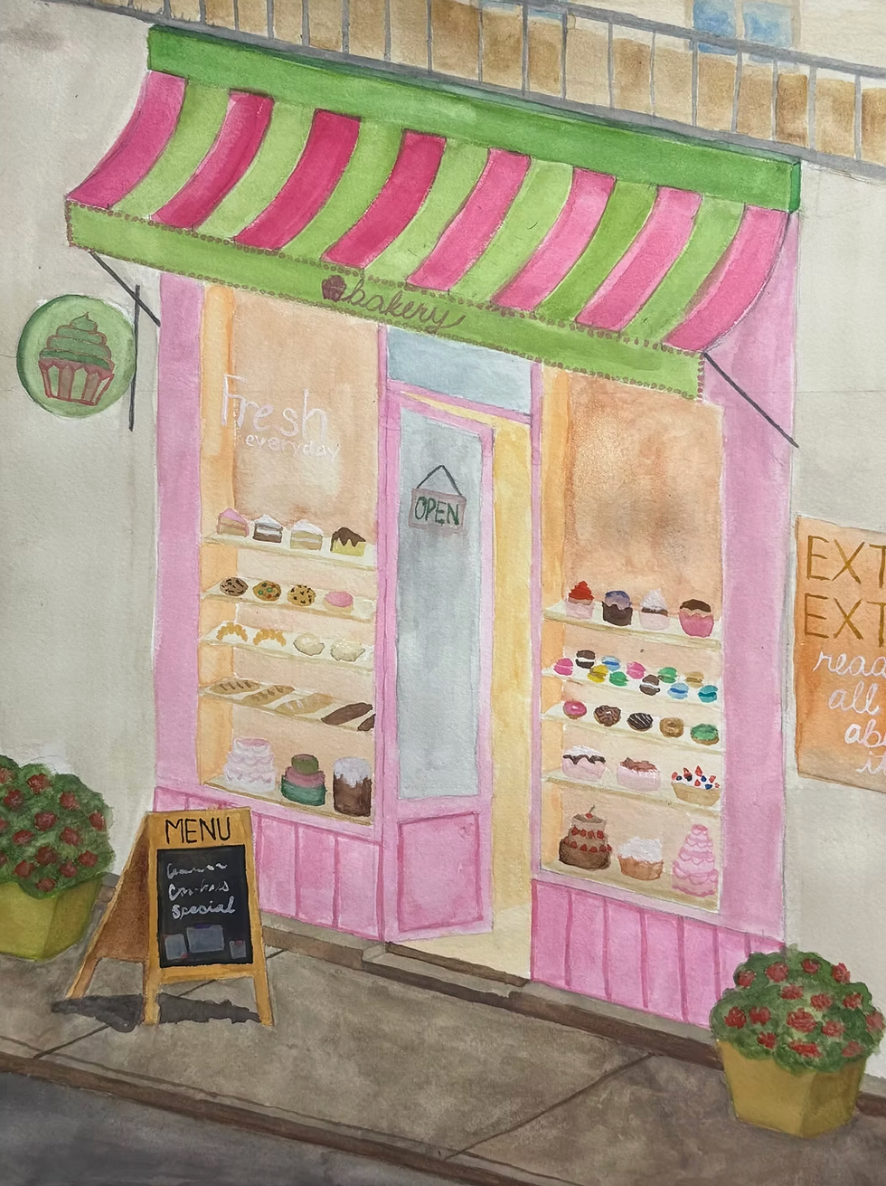
I liked the idea of my home project. I wanted to focus more on architecture, so I decided to zoom in and not have any nature landscape including a sky. Drawing all the little desserts and signs was a lot of fun. I liked having more creative freedom over choosing whatever I wanted rather than was makes sense in nature. There are many places I messed up, but it was still a fun project. There needed to be more shading as the shop looks pretty flat. I also wish I chose a more saturated wall color because it makes the piece look very dull. I think I used a lot of dull colors that contrast bad with my light colors. I think the dull colors are because I don't know how to layer watercolors properly. Additionally, I messed up on the perspective of the door. It looked fine on my reference picture, but I changed the angles a little, so I think making the door disappear into the top would've looked better.


Comments